Oyster works in the charity sector a lot and we see many of the same sites coming up again and again on charity web briefs as sites that they admire. We thought we’d share the sites that seem to be the most highly acclaimed by the charity sector itself.
ACTION FOR CHILDREN
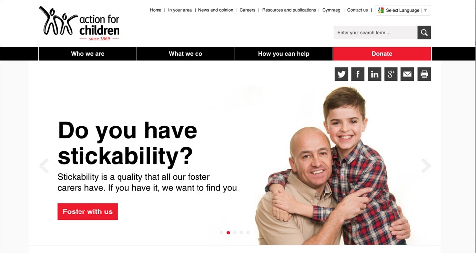
Recently refurbished, the Action for Children site is simple, intuitive and bold. The navigation is really simple and the forms and interactive areas have the easy feel of the direct.gov site.
We love: the simple colour palette, blocked layout that renders effectively to mobile and the clear calls to action near the footer.
RAINBOW TRUST
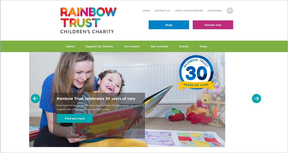
The Rainbow Trust website is bright, bold and friendly. The calls to action are prominent, the footer is brave and the rainbow theme is truly embraced!
We love: The brand and how the website is true to it throughout.
MACMILLIAN CANCER SUPPORT
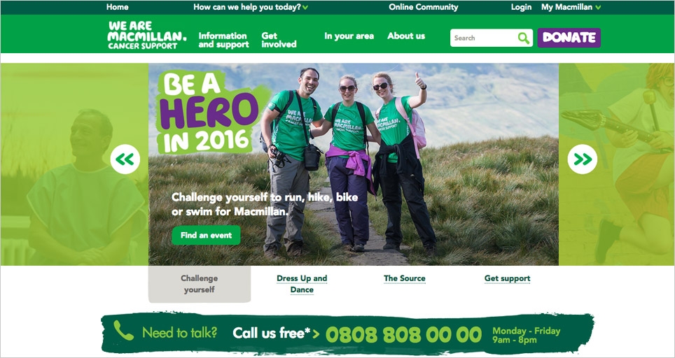
Everyone loves the Macmillan brand. The hand drawn elements break up the layers of the site and make it easy to flow through the content. The banner is full on and has lots of elements to navigate through without leaving the home page.
We love: The brand! The font works really well in the blocky style and the simple complementary colour palette makes each section stand out.
OXFAM
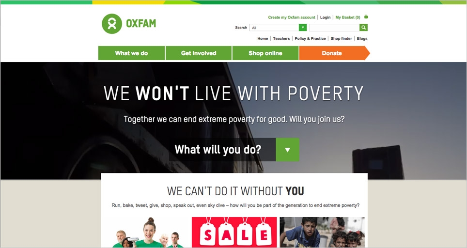
The Oxfam site is simple and to the point. The main navigation has just four elements and the banner messaging is very effective.
We love: The video banner, the button styles and the ‘strip’ at the top of the page, which adds interest.
SHELTER
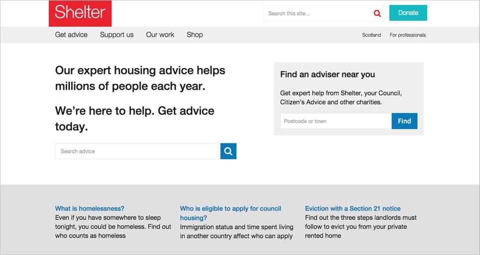
The shelter site’s primary audience is the people they seek to help. This is really well managed on balance with their fundraising and campaigning efforts on the site.
We love: The exceptional usability of the site. Has the feel of the Direct.gov site, making it really easy to use. The colour palette is simple and effective in drawing the eye to key content.
BLUE CROSS
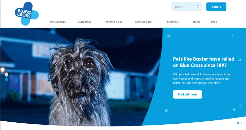
The home page banner has a lot of impact and the use of images on any animal charity site is really important! The illustrations are a really nice feature and give the site personality.
We love: The simple and effective footer – of all things! We also love the curves that challenge the straight bars of colour we’re now used to seeing on ‘scrolling’ websites.
MARIE CURIE
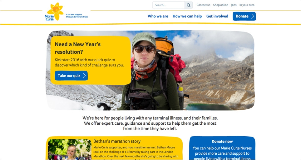
The illustrated style of the brand is adhered to well and the colour palette is strong and works well with the white background. There’s a lot on the homepage but the clever design stops it from feeling cluttered.
We love: The hand drawn style of buttons and banners.
WWF
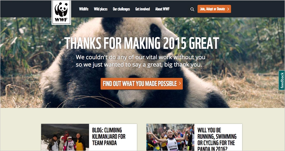
We’ve been seeing this one for years and it’s still a favourite amongst charities. The use of images and typography is really strong and the secondary colour palette works well to brighten up the brand black and white.
We love: The photography and some of the hover states and interactive elements that make using the site more engaging.
DOGS TRUST
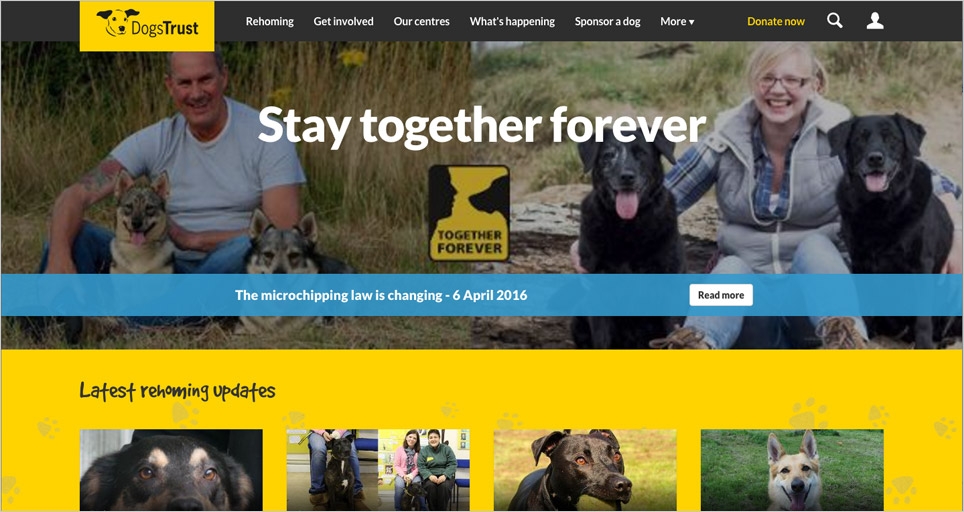
The Dogs Trust site is very busy but in a good way! The brand is strongly presented and the many many images are well laid out.
We love: Some of the fonts used and how colour is used to aid navigation.
Which is your favourite? Got some more to add? Drop us an email on hello@oysterdesign.co.uk.
Read more about Oyster as a charity website design agency.
