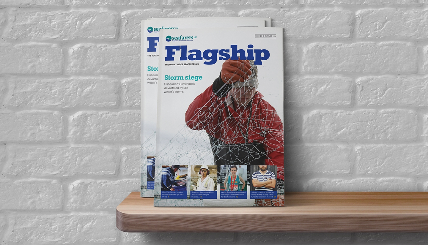
New magazine design and messaging to compliment our recent brand refresh for Seafarers UK.
Seafarers UK
The challenge
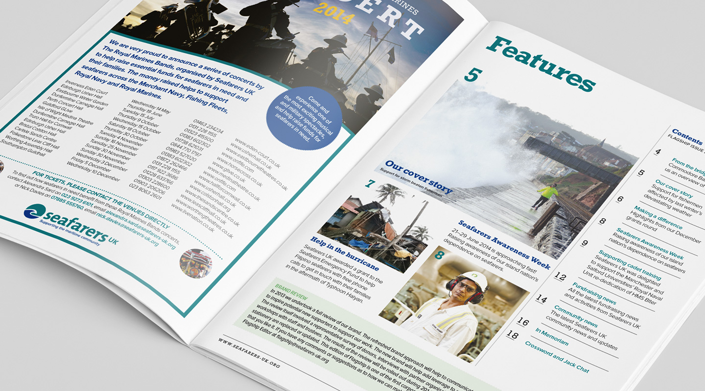
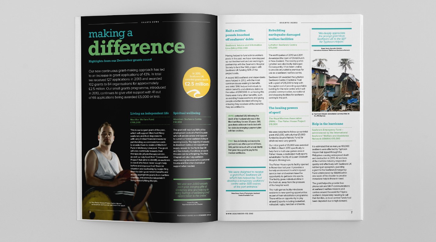
To redesign the 28 page A4 magazine to improve engagement, promote the work of Seafarers UK and increase return on investment. Oyster provided copywriting services to help focus messaging and unify the style and tone of copy. The style was to be easy reading and clear signage to each area of activity.
The solution
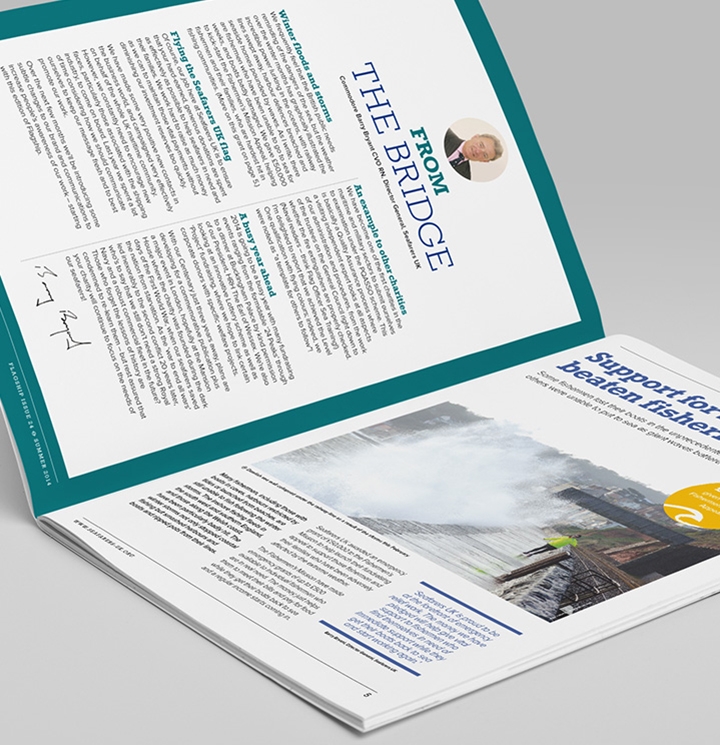
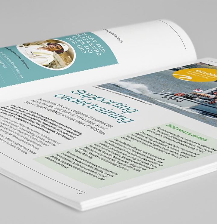
Having recently completed Seafarers UK brand, Oyster overhauled the old magazine and designed new layouts within the new guidelines. The magazine has been given a very reader friendly format with breathing space for imagery and articles that allows the reader to fully engage. The magazine also focuses more on the achievements of the charity and 'calls to action' allow readers to access further information or support specific campaigns.
More of our work
