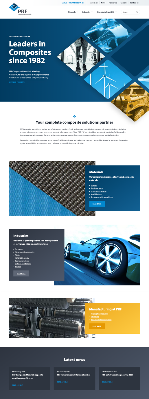
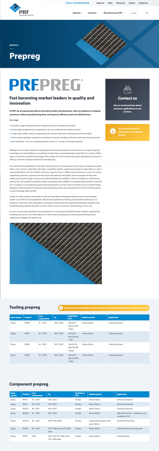
We have loved working with PRF Composites over many years. Evolving the brand, designing brochures, exhibition stands and digital assets, building the website and branding products has all been part of our ongoing relationship.
Shaping brand communications
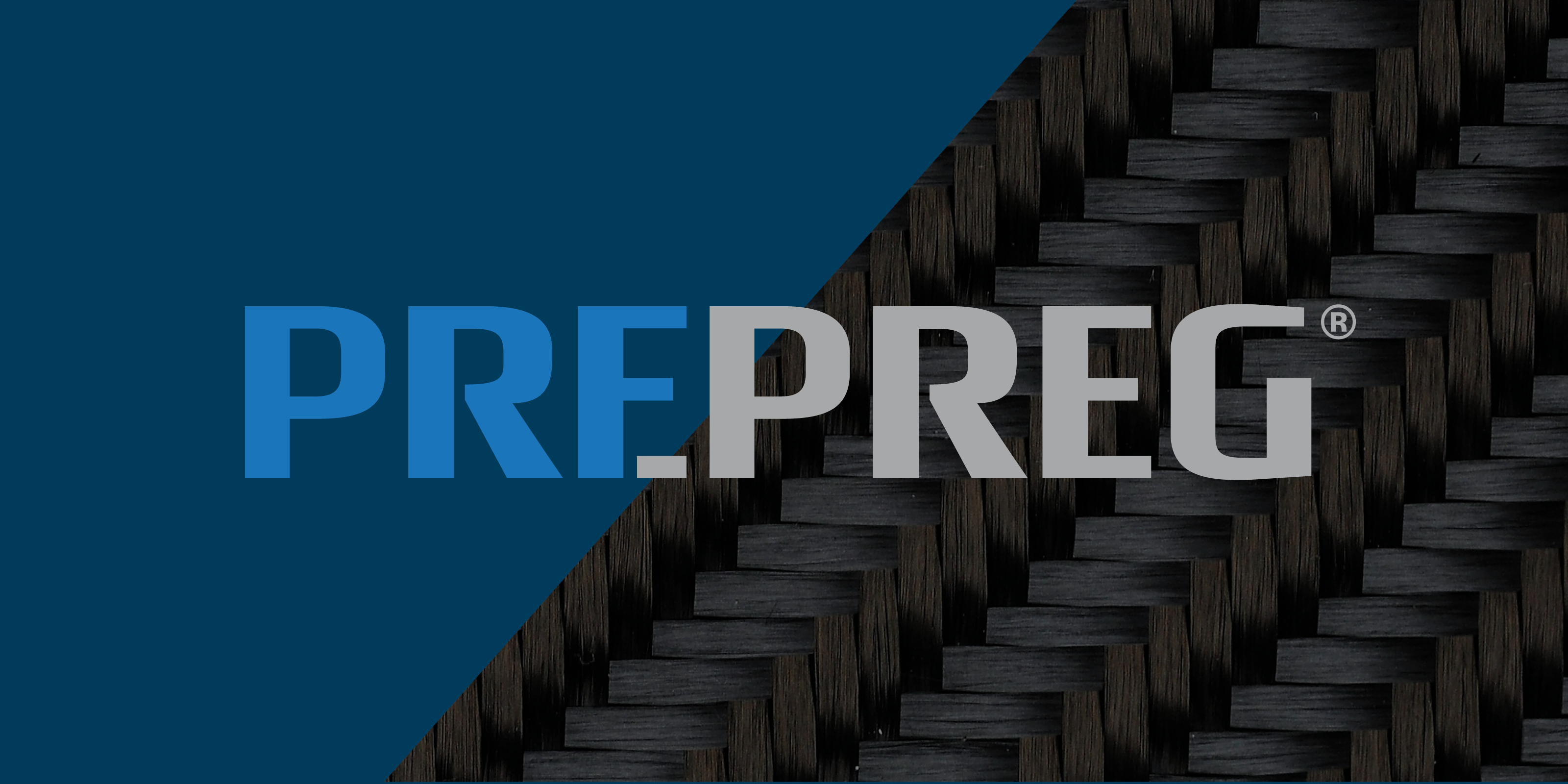
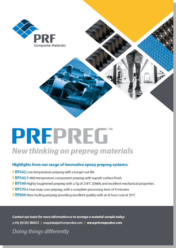
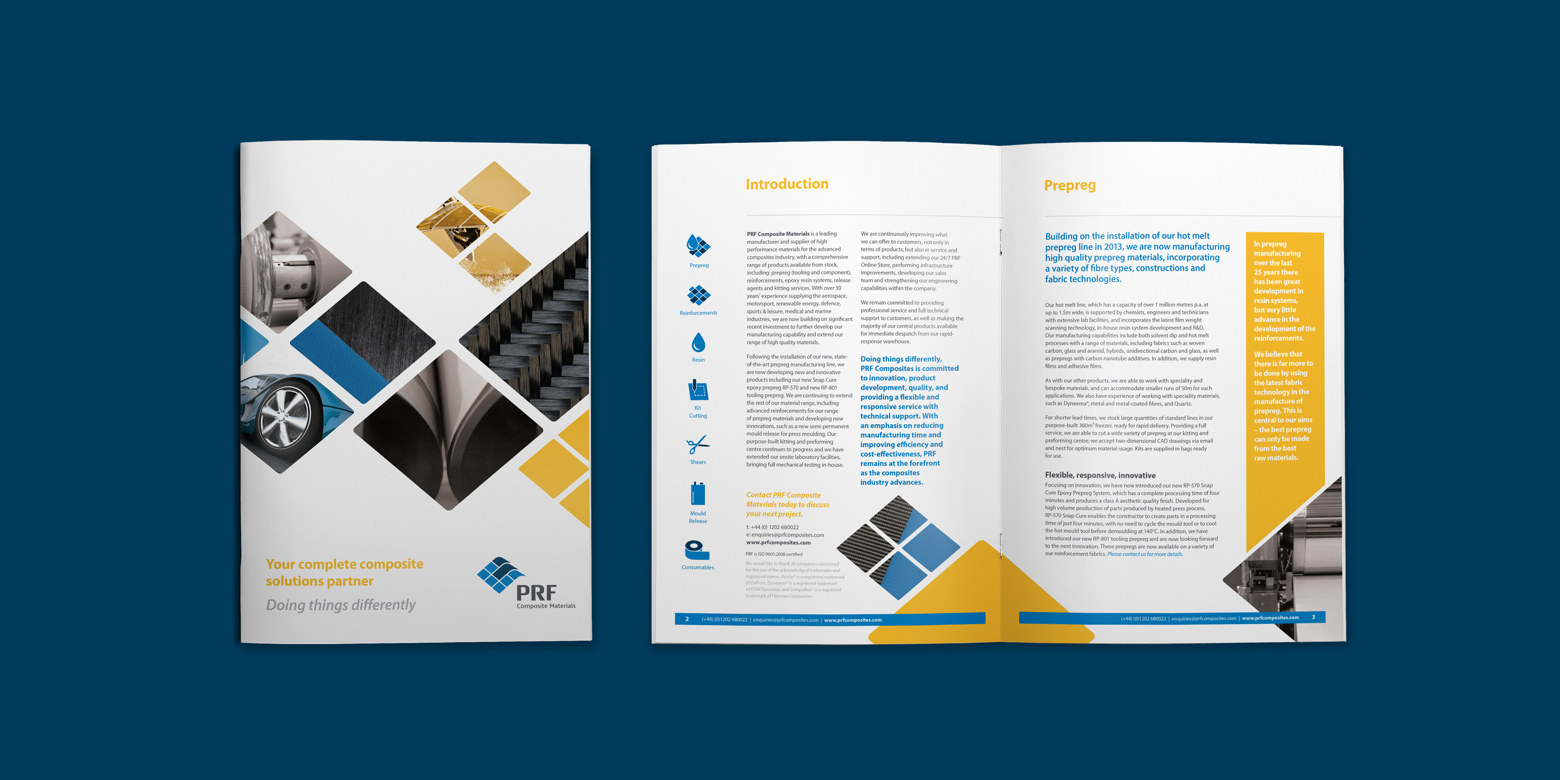
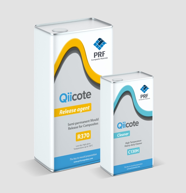
Some of our early work with PRF included a modernisation of the brand and the introduction of a secondary colour, yellow, to help lift the design style. We evolved a graphics style employing the graphic from the logo and introduced this into print and digital communications. In addition we brought some textures through into the brand style to reflect the highly specialised composites they manufacture. One of the annual requirements is the design of the PRF exhibition stand and supporting materials which we always enjoy.
A flexible design style
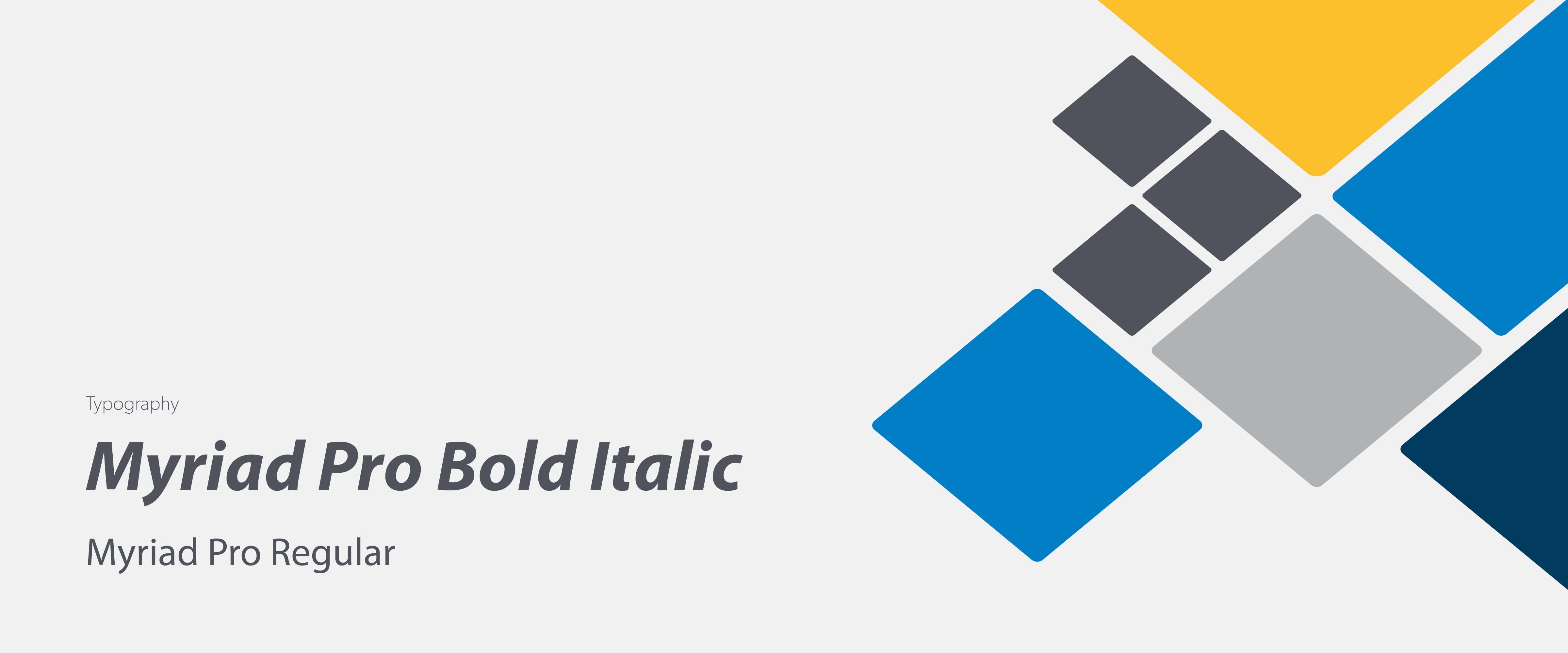
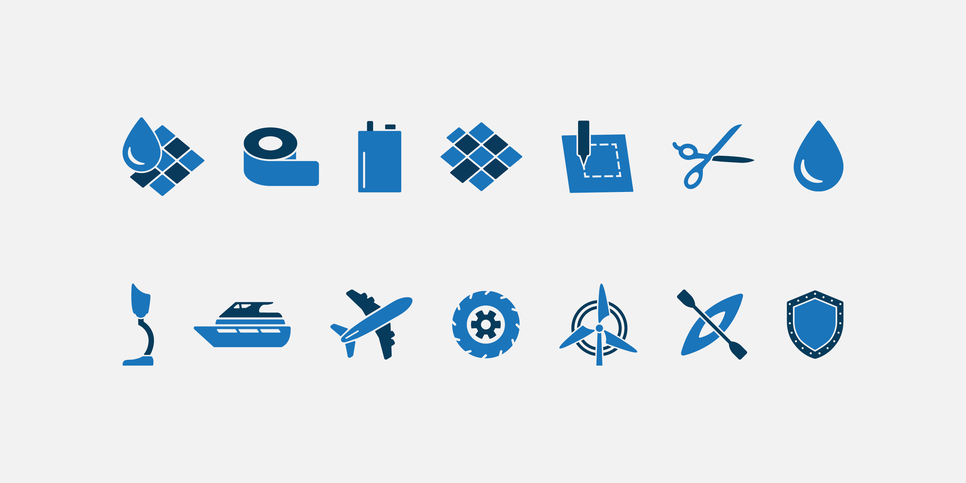
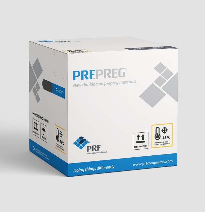
As a specialist composites company that also sells a number of off-the-shelf products, PRF's communications need to be flexible and prominent in a competitive marketplace. The design style and graphic device allows easy adaptation and translates across all mediums. The introduction of an illustration style and icons to demonstrate key product strengths and differentiate services further enhances marketing communications.


Developing a consistent online presence
Following enhancements by the Oyster design team to the PRF brand and look, Oyster worked with the PRF team to develop a new website that not only reflected the new look and feel of PRF but also gave them the space to display their wide range of high-performance materials for the composite industry. With a wide range of features and mechanics, the PRF website has become a key tool in the sales & marketing process of the company.
