Digital marketing often focuses on driving traffic to a website. This is a really important part of marketing and is rightly given top priority by many marketers. That being said, engaging and converting your users once they do visit your website is (in our opinion) just as important. After all, it is no good having a widely viewed page if it doesn't convince anyone to contact you/support your cause/attend your event.
Tools such as Google Analytics allow you to measure a number of key metrics that allow you to track engagement throughout your website. Metrics such as bounce rate, average time on page, average time on site and average page views per visit are crucial for painting a picture of how our users behave and interact with your website while visiting it.
Below, we have highlighted a number of key ways you can ensure your website is engaging its users as effectively as possible, as well as providing some examples of some of our clients who have done a great job at engaging their site visitors.

Clear opening message/page title
Confusion or lack of understanding is one of the most common reasons why a user may not engage with your website and landing pages. By providing a clear page title or opening message, you will instantly reassure users that they are in the right place and that your website can provide them with the information they are looking for.
Often appearing above the fold (can be seen without scrolling), page titles and intros are the first impression your website gives a user. That is why it is crucial to ensure that within seconds of reading the copy, the user understands who are you are, how you can help and why they should read on.
Below are a number of key questions to ask yourself when reviewing your website:
- Does my page title represent the content on the page?
- Does my introduction text explain who we are and how we can help?
- Does my introduction finish with a clear reason to continue reading
- Is my page title/intro text using excessive industry jargon or technical terms?
- Does my page design ensure it is obvious what the next steps on the page are?
Example - Burningsuit
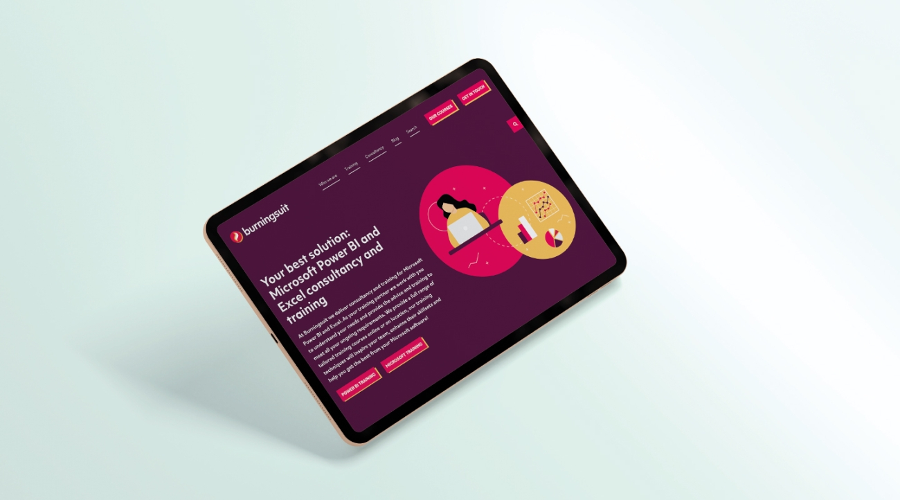
Burningsuit are a training and consultancy company who provide complex training in a range of different Microsoft platforms. As a very niche training provider, they need to be very clear to their audience about who they help and how. Their website design includes a clear description above the fold, alongside supporting page title and sub-titles that clearly explain the company, who they are and how they can help.
Use of video/animation
Video and animation is becoming a common way of making websites feel more engaging and exciting for users to view. There are a wide range of ways to embed video to improve your website including in page banners, introduction videos and subtle scrolling animations.
Video marketing experts Wistia ran a study on their own website to show the effectiveness of video on their site and found:
“People spent on average about 1.4x more time on pages with video than without!”
Wistia
The great thing about the recent innovation in video marketing, is there are no longer as costly as they used to be and can be produced quickly and cheaply. Videos used on web pages should be short to remain exciting and engaging and be concise and to the point to ensure they hold the users attention.
Example - St Georges Ascot
St Georges school in Ascot used B Roll Footage as a great way to demonstrate the scale and quality of facilities. We have worked with a number of schools who have used drone footage to show off their impressive school facilities.
Page loading speeds
Slow loading speeds and poor website performance is major reason why users may get bored or click away from your website.
“1 in 4 users would abandon a website that takes more than 4 seconds to load”
Websitebuilderexpert.com
Slow loading speeds can be caused by a number of factors including server performance, website infrastructure and on-page content, such as large images, too many videos etc.
Reducing the time a page takes to load can often be a longer term win which will need input from your development team.
Thankfully, checking your website loading speed is really easy. Google provide a helpful tool that scans your website for any problematic pages. The tool is called Page Speed Insights and you can view it here.
Once you run the tool, it will give you a score out of 100, alongside a number of improvements you can make to your website in order to increase your speed.
Page loading speed is also a key SEO factor, so ensure your website runs as fast as possible is not only an important part of engaging users, but also acquiring them as well.

Introducing supporting/relevant content
In the majority of cases, users are looking for subject matter experts in their field. Proving your knowledge and experience in a sector is a crucial way to engage users, alongside compelling storytelling and attractive looking websites. A key way to demonstrate this thought leadership, is to introduce users to other relevant content within your website, this can be done through a number of different methods, but each tactic demonstrates the experience and knowledge the website holds that a user can access.
Some of the approaches include:
Related news articles & resources
By demonstrating you have multiple webpages focusing on this topic in a range of different formats (news articles, landing pages, resources), users will understand your organisation, your website and your qualities while being encouraged to navigate around your website and engage with it further. This related content (especially blogs & news) can be a key reason why users return to your website over and over and also why they choose to contact and work with you.
Social proof/testimonials
Using case studies and examples of other customers/service users is an incredibly powerful engagement tool. By showing off how the organisation has helped someone, you can build trust beyond what your typical marketing copy can. If you can provide this in the customers own words via a video or quote, this is even more effective.
Links to third party sources
The content you share and reference doesn't always have to be your own. By becoming a conduit for high quality content, you can cement your status as a resource within your sector for those looking for information.
Example - International Cocoa Initiative
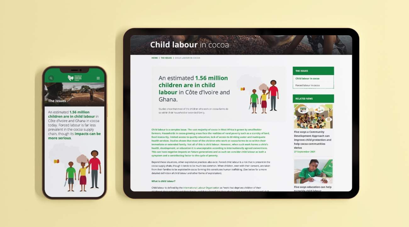
The International Cocoa Initiative generate a large number of news articles, resources and research reports around the topic of ending slavery and child slavery in the cocoa supply chain. A crucial aspect of their website brief was to ensure that related content appeared throughout the website to provide further reading and additional insight to their members and audiences across the globe.
Clear onward navigation/CTAs
We have a saying at Oyster, “web pages shouldn't finish in a dead end”. Essentially what this means is that it is crucial to ensure that every web page gives users a clear next step, either to additional reading or a conversion event such as a form or Contact us page. Through related resources (see above) or a clear call to action, it is crucial that you ensure your users are guided through your website and complete their journeys on the pages you want them to.
Example - Human Rights at Sea
The Human Rights at Sea website uses a wide range of content types and news calls to action (CTAs) to highlight additional reading. They also have clear CTAs at the end of each page that show the user how they can sign up for more information/get in touch for more details. This means that users are not left wondering where they should go next, and are always guided to the next step in their journey quickly and easily.
Conclusion
In Conclusion, there are a number of ways to improve engagement throughout your website and the examples we have listed above are just some of them. When looking to measure and improve engagement, the key metrics you should be looking at in Analytics are:
- Bounce rate - look for any high bounce rate pages (anything above 70% should be improved)
- Average pages per session - this shows how effective your onward navigation is
- Average time on page - this shows how well your pages are engaging users
- Exit pages - This shows which pages your users are leaving your website on
If you would like to talk to one of our team about how to improve your website and better engage your audience, get in touch with us today and we will be happy to help.


