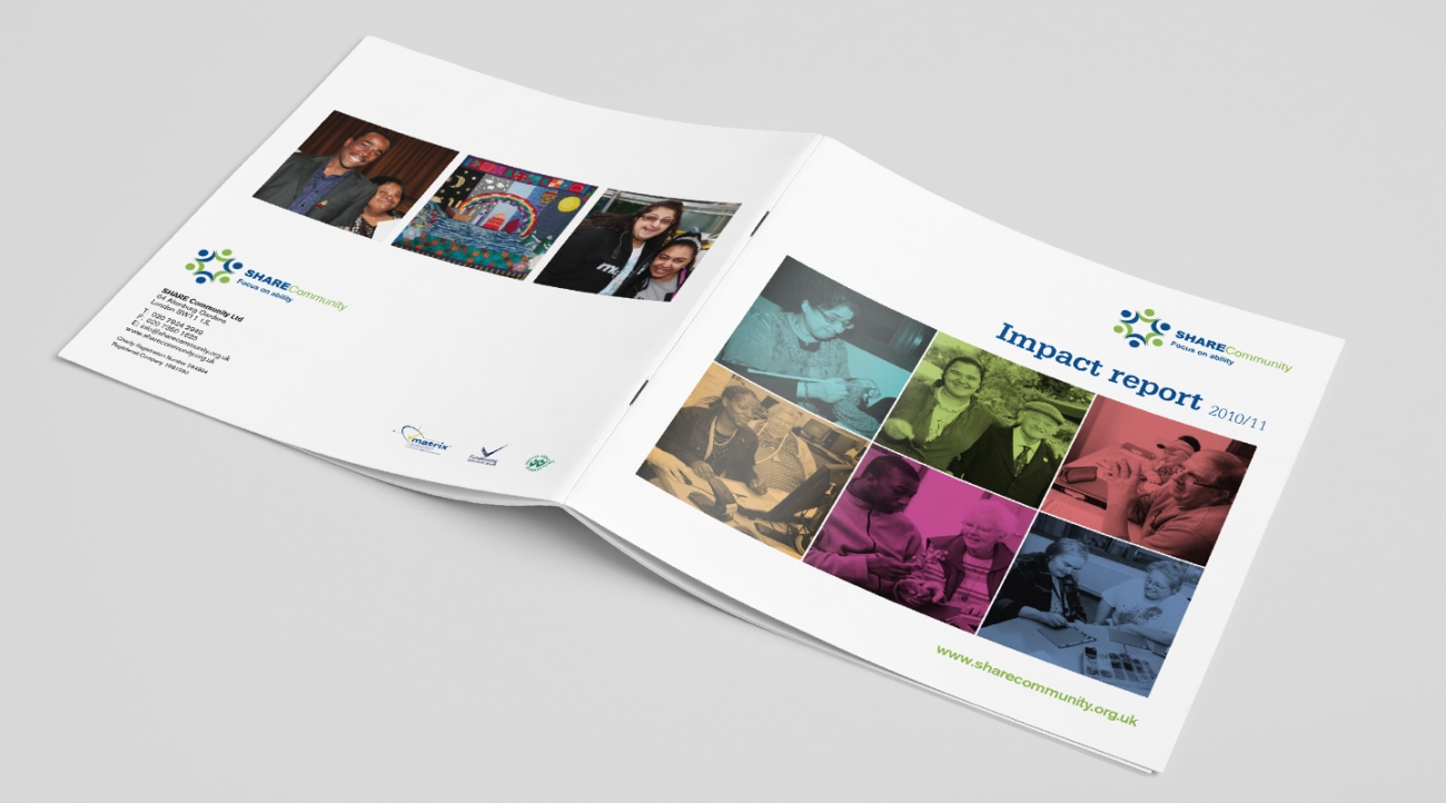
Oyster has been working with charities for ten years and has a lot of experience in designing annual reports and impact reports. From our experience we have some guidance that we like to follow for producing an annual report.
LESS IS MORE
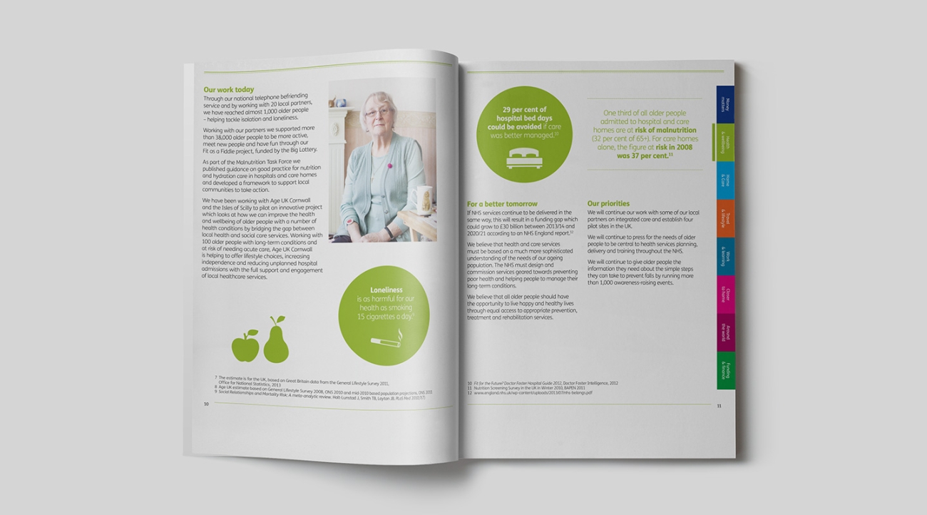
Information overload is easy to achieve but difficult to digest. The best annual reports select the most important statistics and facts to focus on and then use design and graphics to highlight them.

CALL TO ACTION
Yes it’s a report, but it’s still a fundraising tool! We think it is important to include a strong message throughout and at the end of the report, and make it very clear what you want them to do.
THE MOBILE MARKET
There has been an 81% growth in mobile web readership, with 16% of emails now read on devices, 36% at a desktop and 48% via webmail (returnpath. net). Oyster can help you to ensure that your document is accessible to all.

A GOOD MIX OF FACTS AND IMAGES
Were possible its a great idea to include something like a ‘this year at a glance’ page to highlight key achievements over the past year in a bite-size way. You may also want to organise a photo shoot (Oyster can help!) of your service users to communicate in pictures the valuable work you do, coupled with powerful quotes. This can reduce the need for so much text and detail too.
CHARITY COMMISSION GUIDELINES
We like to ensure all the basics are there by checking with the reporting requirements: The Commission’s guidance on Charity Reporting and Accounting essentials (CC15 a).


